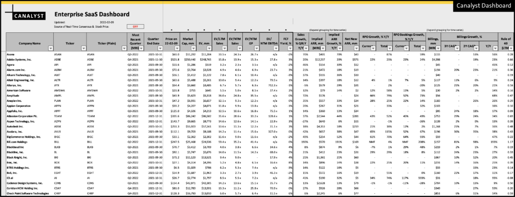
Our clients are familiar with our Enterprise SaaS Dashboard. It is our most popular dashboard and highlights the key drivers from 130+ SaaS names, including Implied ARR, Net New ARR, Billings, Rule of 40, and Magic Number. KPIs are cross-checked for consistency by our dashboard team. An example of the SaaS dashboard is shown below:
The data in the SaaS dashboard is “point in time” as of the weekly update of the dashboard on our site.
In this blog post, we take a look at making the dashboard go from 2D to 3D. That is, pulling the historical data using our Data Science Library Candas.
We can then look at the history of each of these unique KPIs, run historical comparisons, and use regression statistics to answer the question: “Which KPI matters most for this stock?”.
Tickers and KPI
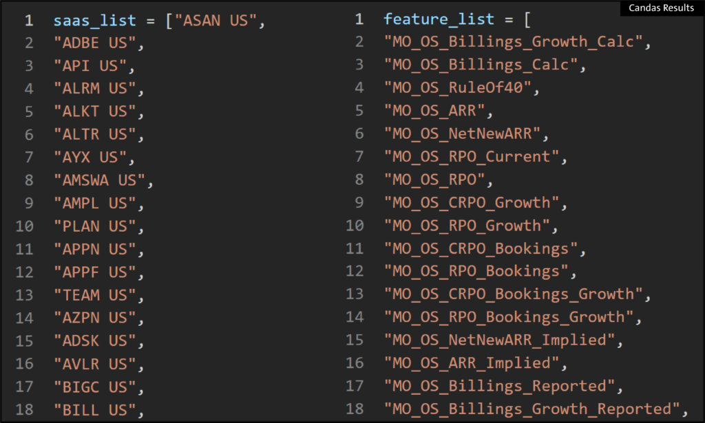
We begin with the list of tickers, and the list of range names from the models which are used to build the SaaS dashboard:
Create a ModelSet
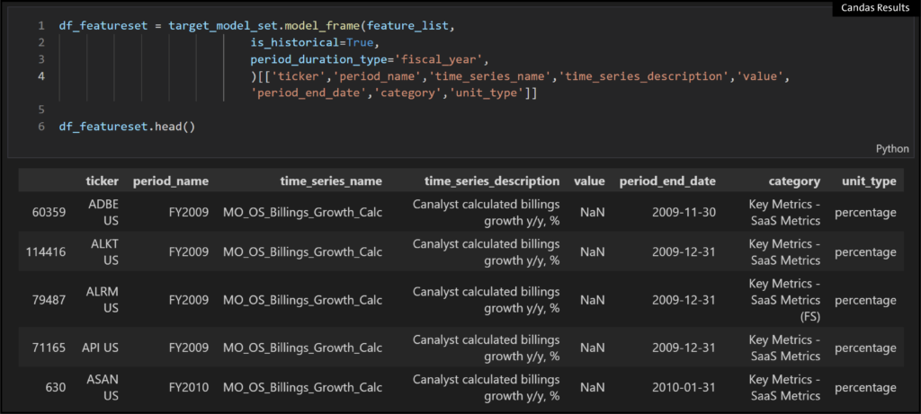
Given these, we can easily create a ModelSet of historical data for the stocks:
Create DataFrame from ModelSet
And then create a Pandas dataframe with the time series names:
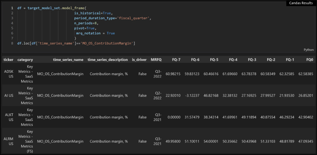
Pivot and Filter
We can take that dataframe and pivot it, and filter to just one time series name to look at a comp screen:
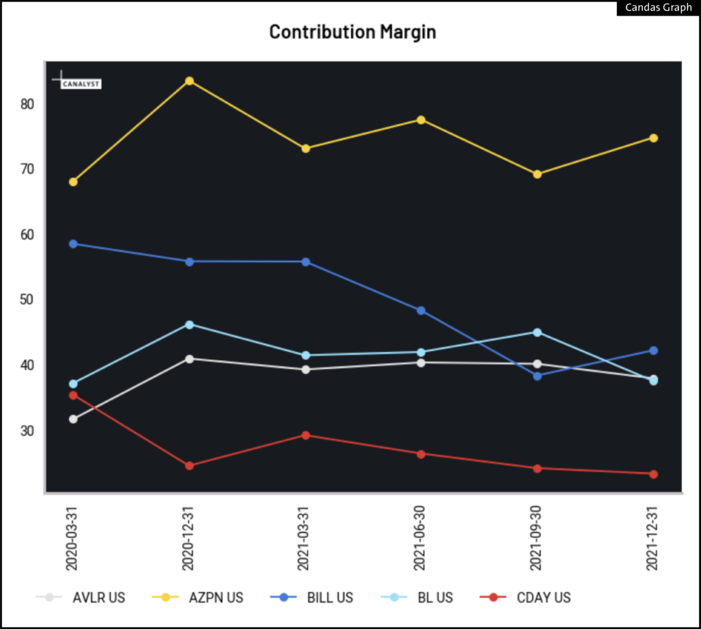
Plot One KPI for a Few SaaS Tickers
Or we can choose just a few tickers, and plot that one time series:
Which KPI is a Key Stock Price Driver
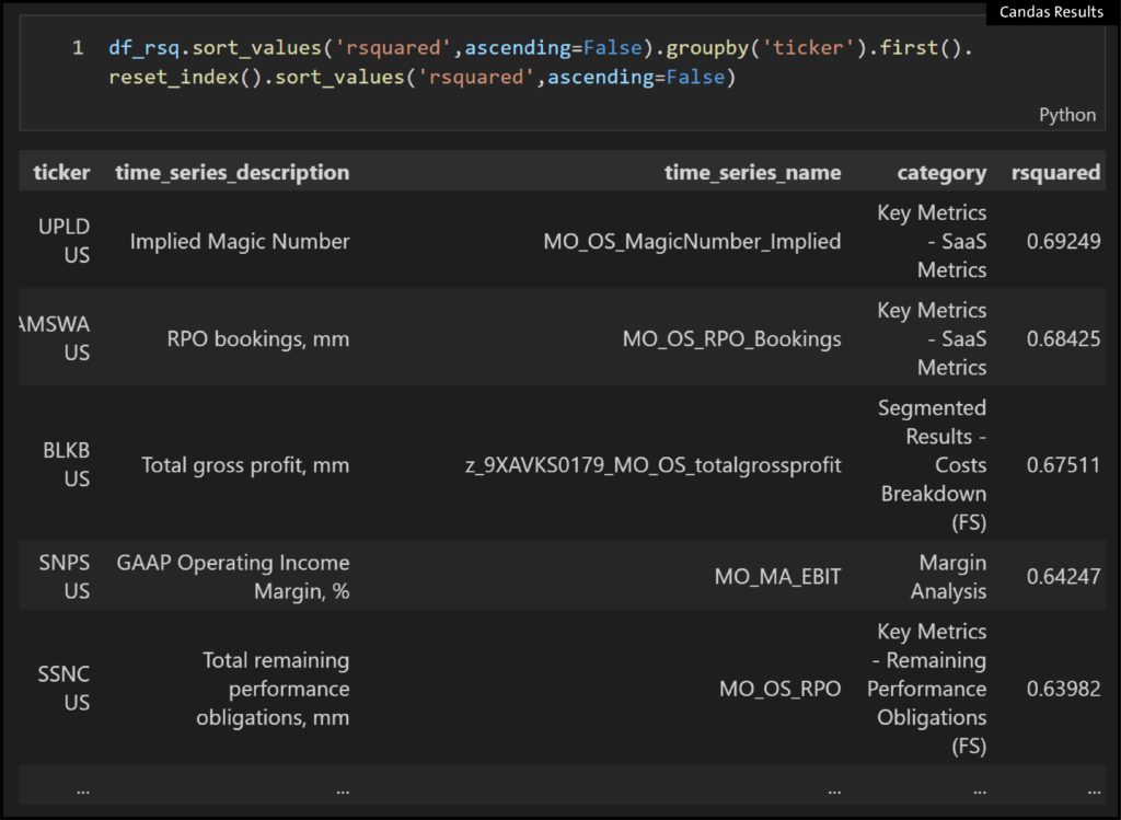
We can also look at which KPI is the most important to each stock by ranking them by their respective r2 values:
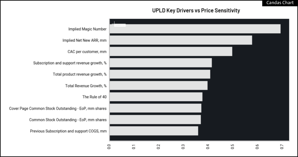
Or for a given stock, what is the most important KPI?
Price vs KPI Visualization
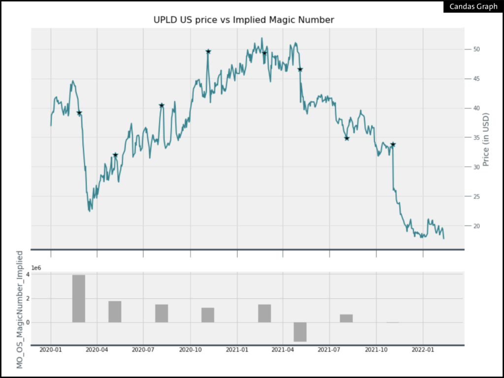
And if we’re looking at just one stock and one KPI, we can put a price chart against that KPI, in this case UPLD US, where the stock price has declined in line with the Implied Magic Number:
